
Blog
Wabi-Sabi vs Japandi vs Minimalist: What’s the Difference?

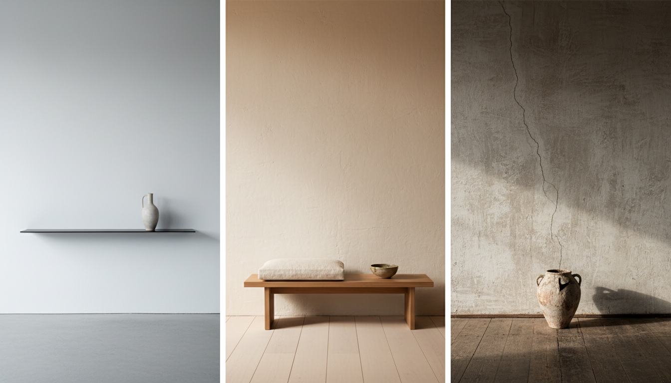
Wabi-sabi, Japandi and minimalism all use quiet, restrained colour, which is why they get muddled. The difference is what each one does with imperfection. Minimalism removes it. Japandi tidies it into warm, functional design. Wabi-sabi puts it in the centre of the work and asks you to look at it.
Getting this right matters when you are choosing art, because a piece that suits one of these rooms can look wrong in another even though the colours match.
The short version
| Minimalist | Japandi | Wabi-sabi | |
|---|---|---|---|
| Attitude to imperfection | Removed | Softened and tidied | Made the subject |
| Surface | Flat, clean, even | Lightly textured, warm | Heavily textured, cracked, raised |
| Palette | White, black, grey | Warm neutrals, pale timber, black accents | Bone, clay, oatmeal, charcoal, rust |
| Composition | Geometric, resolved | Balanced, calm, considered | Off-centre, unfinished, asymmetric |
| Origin | Western modernism | Japanese and Scandinavian design | Japanese aesthetic philosophy |
| What it feels like | Precise | Comfortable | Weathered |
Minimalist art
Minimalism is about reduction. A minimalist canvas is resolved: clean lines, flat colour, geometry that holds together. Nothing is accidental, and nothing is left showing that would distract from the form.
In a room, minimalist art reads as deliberate and controlled. It suits spaces with hard edges, polished concrete, glass and steel. It sits badly beside heavy timber and linen, which start to look messy next to it.
Japandi art
Japandi is a hybrid of Japanese restraint and Scandinavian warmth. It softens minimalism with natural materials, pale timber, and a palette that runs warm rather than cold.
Japandi art tends to be calm and gently textured. There might be a soft linen weave, a muted wash, a simple organic shape. Compositions stay balanced. Nothing is jarring, and nothing looks damaged.
It works in rooms that want to feel comfortable rather than austere: oak floors, wool, ceramics, plants.
Wabi-sabi art
Wabi-sabi comes from a Japanese aesthetic philosophy concerned with transience and imperfection. It values the cracked glaze, the worn edge, the thing that shows its age.
In art that means real, heavy texture: plaster that has cracked as it dried, impasto ridges, colour dragged unevenly, areas left deliberately bare. Compositions are often off-centre and stop before they resolve.
Wabi-sabi work has more presence than the other two. It carries a room on its own and does not need company on the wall. It also demands physical texture, which is why so much of what is sold under the label is disappointing. A printed photograph of cracked plaster gives you the look without the substance, and it shows in person.
If you want the fuller definition, we cover it in what wabi-sabi wall art is.
How to choose between them for your room
Work backwards from your materials rather than your paint colour.
- Hard, cool materials such as concrete, glass, black steel and gloss finishes sit well with minimalist work.
- Warm timber, wool, linen and ceramics suit Japandi.
- Raw or matte materials such as limewash walls, unfinished timber, stone, jute and heavy weaves suit wabi-sabi.
A useful test: stand back and ask whether your room already has visible texture in it. If it does, wabi-sabi art will look like it belongs. If every surface is smooth and even, a heavily textured piece can look like it wandered in from another house.
Can you mix them?
Japandi and wabi-sabi mix comfortably. They share a palette and a preference for natural materials, and Japandi rooms usually have enough warmth to carry one textured statement piece.
Minimalism and wabi-sabi are harder. They want opposite things from a surface. If you are set on both, keep them in separate sightlines rather than on the same wall.
Frequently asked questions
What is the difference between wabi-sabi and Japandi?
Japandi is an interior design style blending Japanese restraint with Scandinavian warmth, focused on comfort and function. Wabi-sabi is a Japanese aesthetic philosophy focused on imperfection, age and transience. Japandi rooms look calm and tidy. Wabi-sabi pieces look weathered and unfinished.
Is wabi-sabi the same as minimalism?
No. Minimalism reduces a surface to clean, resolved form. Wabi-sabi keeps the cracks, ridges and irregularities that show how something was made and how it has aged.
Can wabi-sabi art work in a modern home?
Yes, and it often works better than expected. A single heavily textured piece gives a modern room the tactile relief that smooth finishes lack. It needs space around it and a wall that catches side light.
What colours are wabi-sabi?
Bone, chalk, oatmeal, clay, charcoal and rust. The palette reads weathered rather than chosen, which is why it works alongside timber, stone and linen.
Does Japandi art need to be textured?
Not heavily. Japandi tolerates light texture such as a linen weave or a soft wash, but it stays tidy. Deep cracked plaster reads as wabi-sabi rather than Japandi.
Which style suits a small apartment?
All three can, but the scale matters more than the style. One larger piece reads calmer in a small space than a cluster of small ones, whichever aesthetic you choose.
Where to look
Our wabi-sabi wall art and minimalist wall art collections are painted by hand to order and never printed, so the texture you see in the photographs is texture that exists on the canvas.
If you are still deciding whether a piece you have found elsewhere is genuinely textured, our buyer’s guide to wabi-sabi wall art in Australia explains the checks.
